
When Logos Change, Who Owns the Meaning?
Cracker Barrel just failed to change its logo.

At first glance, it might look like any other modernizing tweak: flatter lines, a cleaner font, a design better adapted to a digital-first world. But to many, it wasn’t cosmetic at all. It was betrayal.
The backlash was immediate. Online communities accused the brand of walking away from what it stood for: a comforting version of Americana, a nostalgia-laden place where time slowed down. The logo wasn’t just wood and barrel and rocking chair. It was a cultural token, a passport to belonging. Strip that down, modernize it, and you don’t just risk alienating customers. You erase a piece of who they imagine themselves to be.
This isn’t new. But in the age of social, it is louder, faster, and more politically charged.
The Function of Rebranding
Rebrands - and especially logo changes - are usually born of necessity.
Sometimes the motive is aesthetic: chasing minimalism, “flat design,” or screen readability. Sometimes it’s strategic: a signal of renewal, of future orientation, of distance from past missteps. Sometimes it’s simply the desire to stay culturally relevant in a world that evolves faster than any design system.
Logos are semiotic bridges: signifiers that point beyond themselves. A good one crystallizes meaning. A bad one ruptures it. What’s crucial to remember is that logos are not property, not really. They live in the eyes, minds, and hands of those who use them.
Before the Age of Social
Back in the pre-social era, logos shifted with less drama. Most people noticed a change but shrugged. Trade magazines debated, design schools analyzed, and maybe a few newspaper columnists waxed nostalgic. But there was no massive stage for communal uproar.
Coca-Cola’s “New Coke” debacle in 1985 was the exception, a consumer revolt over substance (taste) and style (design) amplified by television and print. BP’s sunflower rebrand in the 2000s earned activist critiques but little mainstream frenzy. The conversation stayed narrow, the cycle slower, the noise limited.
The difference today isn’t that people care more. It’s that they can voice more.
When Communities Own the Brand
Social media turned logos into cultural battlegrounds. Brands are no longer demiurges dictating identity from above. They are ecosystems, living organisms defined as much by what people do with them as by what marketers write in brand bibles.
A logo redesign feels personal because it destabilizes tokens of belonging. Consumers project onto these signs not just aesthetic preference, but identity, memory, even political allegiance. And once outrage finds a stage (X threads, TikTok clips, Instagram memes) it becomes a performance. Critiquing or defending a logo is rarely just about design. It’s about signaling who you are, what tribe you belong to, what values you claim.
Gap’s 2010 rebrand lasted all of six days before public outrage forced a reversal. Tropicana’s 2009 packaging redesign was pulled within weeks. And Twitter’s metamorphosis into “X” wasn’t received as bold reinvention, but as erasure — an act of stripping away shared cultural capital and replacing it with corporate whimsy - I have stayed away from the platform since then.
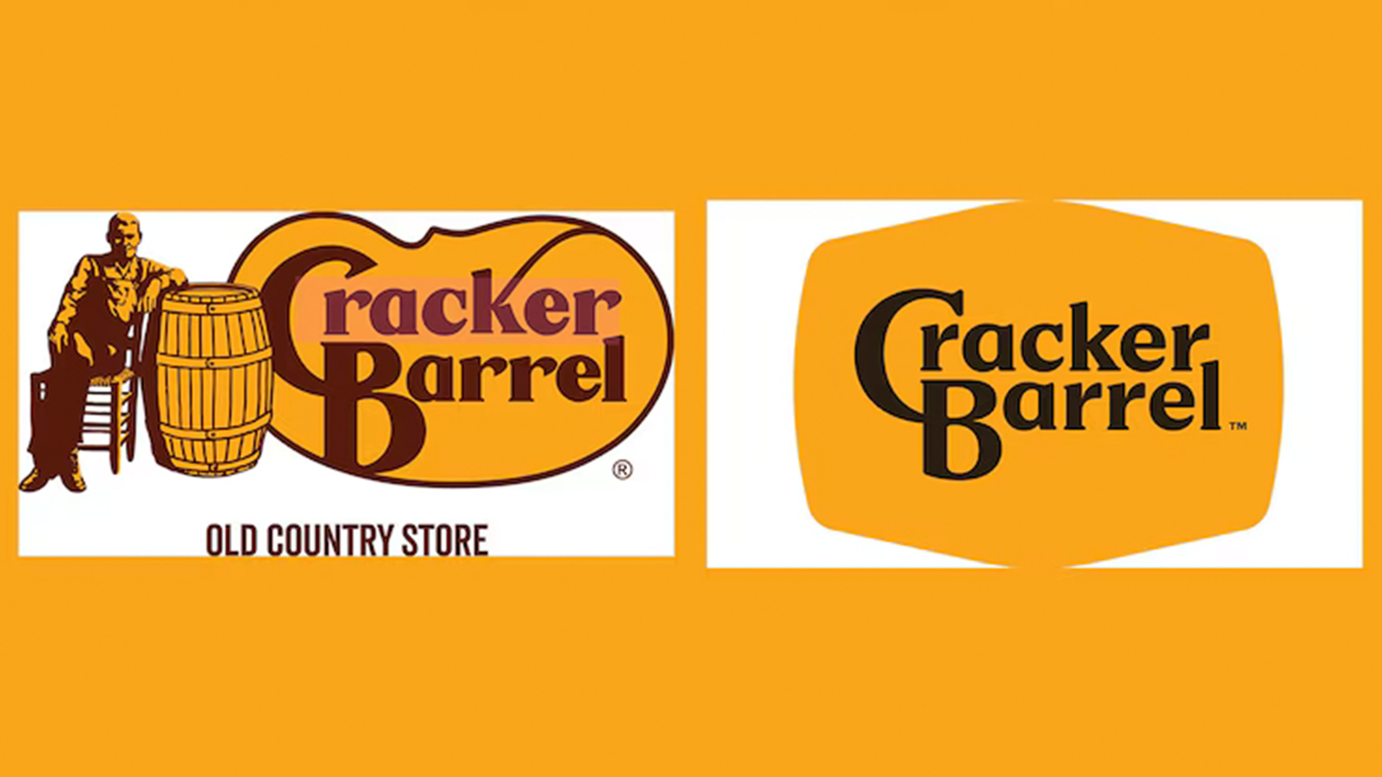
Cracker Barrel’s Case
For Cracker Barrel, the stakes are higher. The brand has long been freighted with cultural meaning: for some, cozy Americana; for others, more exclusionary associations. A modernized logo was read not as graphic refresh but as political act.
In the hypersensitive ecosystem of online communities, every move becomes a proxy war. Critics framed the redesign as an abandonment of “roots.” Defenders saw backlash itself as reactionary. Both sides engaged less with the logo than with what it meant for identity, memory, politics.
The rocking chair and the barrel weren’t just design elements. They were cultural interfaces, and to touch them was to touch nerves.
Rebranding in the Age of Social: What’s Next?
If brands once unveiled rebrands with glossy campaigns, they will now need to rethink the process entirely. The center can no longer hold on its own.
The future of rebranding may be open-source. Brands will increasingly outsource creative power, inviting creators, influencers, and communities to co-design. Generative AI will make it possible to prototype dozens of alternatives, to open-test them in real time, to let ecosystems choose. The winning design won’t be the one most perfect in a design manual. It will be the one most adopted in practice, most remixed, most embraced by communities before the brand even stamps it official.
In other words: logos will be stress-tested not in boardrooms, but in feeds.
A logo is no longer a face. It is a conversation.
In a time when brands are ecosystems, a rebrand cannot be imposed. It must be negotiated. The real question is not “Will they like it?” but “Will they make it theirs?”
Because when logos change in the age of social, what is really at stake is not the color of the typeface or the angle of the curve. It is ownership of meaning itself.
Interesting insights, Anthony. It's complicated, for sure. I remember when Starbucks changed their logo, people hated it and felt betrayed. Doubt any of them care anymore. Gary Kasparov has weighed in on the kerfuffle here on substack, too.